THE LANGUAGE OF FORMS
I love this picture from an old reference book about birds.
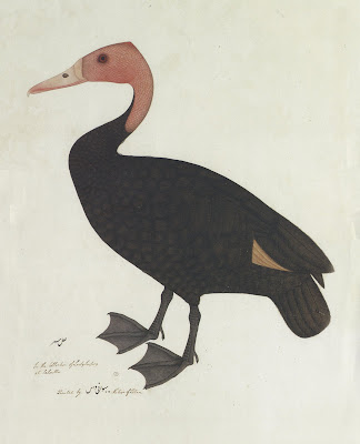
The anonymous artist could have presented the same basic information a thousand different ways, but he chose to emphasize the design. When you look at the shape, the colors, the negative space, you know right away: this was an artist who understood the language of forms.
In previous posts about the enduring importance of design, I have shown pictures from the Museum of Modern Art or recent graphic novels that are not as concerned with design or other aesthetic qualities. For example, one famous graphic novelist wrote, "if one tries to look at my strips as 'good' drawings... they're not, but ... I'm able to write with pictures without worrying about how I'm drawing something."
I always thought it was the job of an artist to be "worrying about how I'm drawing something," but my narrow minded attitude has only provoked scorn from readers who believe that "good," well designed pictures are no longer as important, especially for sequential art. Samples of their feedback:
But good design doesn't limit an artist to pretty or ugly, detailed or simple, realistic or abstract, fast or slow. Any of these approaches can be either well designed or poorly designed. Ever since art began, the challenge for the artist has been to marry content with "good" pictures, not to surrender one for the other.
The map maker who drew this 15th century map of the world could have displayed accurate information without worrying about composition, style or color. Yet, he obviously felt that a visual medium demanded attention to aesthetics as well as content:

The same could be said about this Tibetan image explaining the "wheel of law." The artist could easily have ignored considerations of form and resorted solely to a technical diagram. He did not.

Egyptian wall paintings tell complex religious and historical narratives. Yet, after overcoming dozens of obstacles not faced by artists today, the artist made sure that his images were also beautifully designed, right down to the smallest little figure in the corner:

Artists who can speak the language of forms are sensitive to the balance, the rhythm, the harmony and aesthetic designs of nature, and are capable of employing those magical powers in images. The artist who drew that bird understood he was in the presence of sacred things.
Artists are of course free to grant themselves exemptions from any standard or challenge. There is no law preventing an artist from saying, "I don't care about making good pictures because I have other priorities and I can't handle both at once." But 30,000 years of art history proves that good content is not incompatible with good form. Artists who lack this ability, or who lack the drive to do things with this ability, will always be second rate to me.

The anonymous artist could have presented the same basic information a thousand different ways, but he chose to emphasize the design. When you look at the shape, the colors, the negative space, you know right away: this was an artist who understood the language of forms.
In previous posts about the enduring importance of design, I have shown pictures from the Museum of Modern Art or recent graphic novels that are not as concerned with design or other aesthetic qualities. For example, one famous graphic novelist wrote, "if one tries to look at my strips as 'good' drawings... they're not, but ... I'm able to write with pictures without worrying about how I'm drawing something."
I always thought it was the job of an artist to be "worrying about how I'm drawing something," but my narrow minded attitude has only provoked scorn from readers who believe that "good," well designed pictures are no longer as important, especially for sequential art. Samples of their feedback:
Art Spiegelman and Chris Ware are geniuses and should not be judged by old fashioned standards for drawing.
The drawings in Panter's comics... are not meant to be studied like... paintings..., they are meant to tell a story.
You are completely on crack. I have never seen such a misguided discussion in my life.... the art world is horrifically driven by vacant aetheticisms...
I think you are mistaking the sequential storytelling of comics with illustration.... If the focus of your blog is ILLUSTRATION ART, perhaps you should stick to that and not try to include Chris Ware in a category he does not belong.
A couple of suggestions for you Dave; grow up & wise up.
Sorry, David, but you have no idea what you're talking about. Go back to reading batman; you're totally out of your depth in trying to understand why Ware is a great artist
These artists make images that could be called bad drawings by someone looking for something pretty, but in actuality have great ideas behind them... Maybe because the drawings are essentially "bad drawings", it is hard to distinguish what is actually good from what is bad.
But good design doesn't limit an artist to pretty or ugly, detailed or simple, realistic or abstract, fast or slow. Any of these approaches can be either well designed or poorly designed. Ever since art began, the challenge for the artist has been to marry content with "good" pictures, not to surrender one for the other.
The map maker who drew this 15th century map of the world could have displayed accurate information without worrying about composition, style or color. Yet, he obviously felt that a visual medium demanded attention to aesthetics as well as content:

The same could be said about this Tibetan image explaining the "wheel of law." The artist could easily have ignored considerations of form and resorted solely to a technical diagram. He did not.

Egyptian wall paintings tell complex religious and historical narratives. Yet, after overcoming dozens of obstacles not faced by artists today, the artist made sure that his images were also beautifully designed, right down to the smallest little figure in the corner:

Artists who can speak the language of forms are sensitive to the balance, the rhythm, the harmony and aesthetic designs of nature, and are capable of employing those magical powers in images. The artist who drew that bird understood he was in the presence of sacred things.
Artists are of course free to grant themselves exemptions from any standard or challenge. There is no law preventing an artist from saying, "I don't care about making good pictures because I have other priorities and I can't handle both at once." But 30,000 years of art history proves that good content is not incompatible with good form. Artists who lack this ability, or who lack the drive to do things with this ability, will always be second rate to me.


