Posts

Showing posts from April, 2011
Image
. . Coastal City, photoshop. .

MENE, MENE, TEKEL UPHARSIN

Image
The traditional recipe for a mural requires: One (1) person wealthy enough to own a big wall; and one (1) person talented enough to paint on it. Unfortunately, these two ingredients don't always mix well.  The reason for this probably dates back to ancient Babylonia.  The cruel and powerful King Belshazzar , worshipper of gold and merchandiser of the souls of men, had conquered all his neighbors.  He had nothing left to fear from anyone.  Yet, when he held a victory feast for a thousand of his princes and warlords, Belshazzar became rattled by markings he discovered on his palace wall: Poet Sir Osbert Sitwell beautifully described this biblical story, and what happened when the great king saw the famous writing on the wall: And this was the writing that was written: "MENE, MENE, TEKEL UPHARSIN" "THOU ARE WEIGHED IN THE BALANCE AND FOUND WANTING." In that night was Belshazzar the King slain And his kingdom divided. Whatever the origins of the bad blood,  trouble ...
Image
. Watercolor Sunflowers 15"x 20" and ink rough 3"x5". .

An ODE to CONTRAST (verse 6)

Image
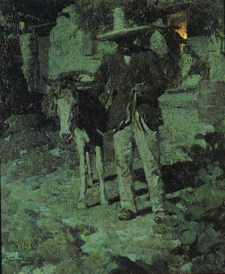
Because contrast is a game of extremes, it gives an artist license to cast aside nuance and embrace all kinds of lurid and gorgeous combinations of color and form. Frank Tenney Johnson George Innes Carl Spitzweig Still, it's not true that the farther apart the elements, the greater the contrast.  On the contrary, contrast has to remain confined by a common set of rules or it becomes less effective.  Contrast between elements of equivalent weigh tends to create tension, while contrast between elements of unequal weight tends to create movement.  Either of these relationships can be powerful, but they require the elements to be tethered together if we want to create the illusion of greatest distance between them.  If you just try to place elements as far apart as possible, without a common set of assumptions, you run the risk of punching a hole in your picture, through which all of the integrity of the image will simply drain out onto the floor:
Image
. . Roughs for How to Train Your Dragon. .

An ODE to CONTRAST (verse 5)

Image
Contrast is like those bad boys your mother warned you to stay away from but you just couldn't help yourself. When you first encounter a picture, your eye is irresistibly drawn to the points of greatest contrast.    Other parts of the picture-- the largest shape, the prettiest color, the darkest or lightest form-- may strive for your attention but there's something about contrast that always catches our eye first. In this painting by Motherwell, our eyes pass over the huge black shape and go right to the tiny corner with the contrast. Milk contrasted against the shadows in N.C. Wyeth 's lovely painting Arthur Mitchell This doesn't mean that contrast is the best or the most important part of a picture.  To the contrary, pictures contain many other fine, respectable elements.  As your mother told you, once you get past first impressions you may learn to appreciate subtle details and other less glamorous virtues.  All it takes is patience and time. Harvey...

An ODE to CONTRAST (verse 4)

Image
When Alex Raymond drew the comic strip Flash Gordon , he often used  smooth, tapered lines that flowed seamlessly from light to heavy, from narrow to wide. They were dazzling.  However, as he matured as an artist, Raymond no longer worried so much about blending the two extremes.  Instead, by the time he drew the strip Rip Kirby years later, he would contrast light, airy pen strokes with thick, choppy brush strokes, leaving them to co-exist on the page in sharp juxtaposition to each other. Compare the subtlety and precision of Raymond's lacy lines forming the  head and hands with the raw brush marks on the man's shoulder Compare the strength of the chiseled effect on the man's overalls with the more refined, mellow lines in Flash Gordon (above) A fine, diverse assortment of line.   I promise you, this change in Raymond's approach was not because he forgot how to make smooth gradations in line.

An ODE to CONTRAST (verse 3)

Image
Artists have experimented for centuries with visual techniques for contrasting opposites.  However, it is difficult to think of an example which has benefited from so much enthusiastic experimentation as the contrast of something small, pretty and vulnerable with something big, mean and scary: Let's see if we can tiptoe around some of the murky reasons people enjoy pictures of women in peril and focus instead on the interesting contrast at the heart of this popular genre.  The pulp magazine covers of the 1930s and 40s merely continued a tradition that stretched back to medieval paintings of St. George & The Dragon (where a helpless virgin was chained to a rock, to be gobbled up by a fierce monster) or silent movies (where a helpless girl was tied to railroad tracks, to be run over by a fierce steam engine).  No mere gun or knife would do; it was the enormity of the disparity that makes these works successful. As Frazetta shows us, sometimes it heightens the excitemen...

An ODE to CONTRAST (verse 2)

Image
Saul Steinberg was an artist of insatiable intellectual curiosity.  His imagination overflowed with fresh, orthogonal views of the world and he came up with so many connections and comparisons that he sometimes had to stash long lists of them in imaginary cabinets and closets.  Sometimes he went beyond words, and diagrammed the meeting of two concepts: The juxtaposition of these concepts is plenty thought-provoking, and Steinberg's little diagrams add a nice touch of whimsy and mystery.  But I confess a special fondness for Steinberg's pictures where his contrasting concepts have been integrated into the pictures, not just spelled out in words.  Here, Steinberg puts a  mechanical, symmetrical image in bed with a fanciful flourish and leaves us to imagine their love life: Here, Steinberg compares two realities using a clever graphic device:   In my view,  the contrast of these concepts is more successful in images than in words.

An ODE to CONTRAST (verse 1)

Image
Peripheral vision may be our greatest weapon against ignorance.  Your eyes don't need to stray more than an inch before they might bump into a view of reality that is startlingly different from your own: Matter and antimatter coexist in this catalog of classes from the Learning Annex Of course, we can't always rely on our peripheral vision.  Sometimes we have to seek out contrasting views.   For example, if you were a young woman with artistic talent in the 1950s, you might find this type of ad quite persuasive: Just look at my art director! But unless you took the extra effort to check out what was going on in magazines for young men, you might never realize that the same art schools were wooing your male counterparts with a very different set of promises: Do you like Art?  This may explain why some people argue that the best way to avoid unhappiness is to wear blinders.  If you try to reconcile two conflicting extremes you'll only end up...
Image
. . Compressed charcoal and nupastel on strathmore charcoal paper, 15"x20". .
Image
. . Compressed charcoal on paper. .